Creating a timeline of patient interaction
Designing the Pathways action history
Team
Kejia and Rosalinda (product management)
Farhan, Irtiza, Usman, and Elle (development)
Skills
UI/UX design
User research
Information architecture
Problem
Users had difficulty understanding the history of interactions with the patient.
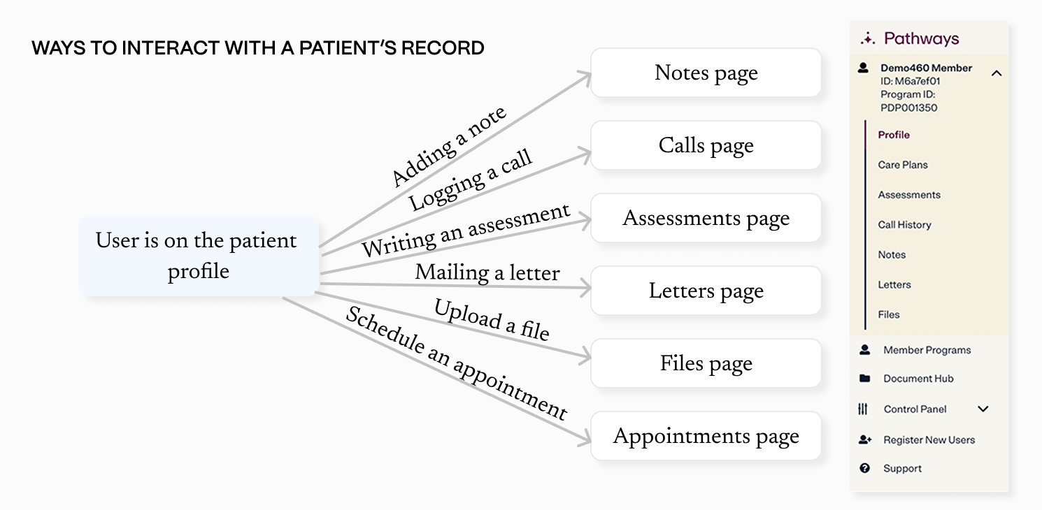
Care managers had trouble navigating a patient's Pathways record because each type of interaction had their own separate page. For example, we had one page where a care manager could add a note to the patient's record, a different page to log a call, and another page to upload a file.
Definitions
- Pathways: an internal care management application intended for our users (care managers) to manage their patients and check up on their health.
- Care managers: healthcare professionals who coordinate a patient's care, ensuring they receive the appropriate medical and social support to improve their health outcomes.
Goals
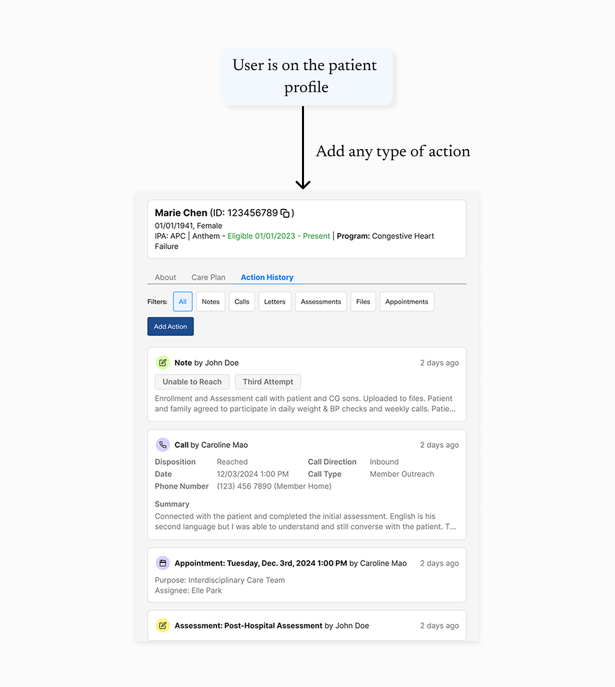
- Create a unified timeline where users can easily add, edit, and view actions they've taken on a patient's record.
- Help users quickly get up to speed and understand how previous care managers engaged with a patient.
- Stay in compliance with health insurance requirements. Our care management teams get audited by several different health plans, so the UI has to clearly show the info auditors need.
Prior context
Care managers could log various types of actions in Pathways.


Deciding the new workflow
In my time as the solo designer on Pathways, I'd already gotten a lot of context and user input about specific needs for each individual action.
However, I needed to avoid basing my design too much on the existing workflow. The pivot to a unified action history would require users to relearn how they use Pathways—I was committing to a strong opinion on how they should be doing their work, rather than waiting for them to decide themselves and tell me.
Version 0
Setting the direction
My initial wireframes over-anchored on the existing UI, using separate workflows for each action type. For example, some actions were displayed in table views while others used list views, depending on their associated data. I was concerned that creating a single, generic workflow might not meet the unique needs of each action type.
However, feedback from my teammates convinced me that standardizing workflows would create a smoother and more intuitive experience. Users would more easily learn the new workflow if it was as simple and consistent as possible.
I drew inspiration from activity feeds in customer relationship management software (CRMs), as Pathways functions similarly to a CRM but with a healthcare focus. This design pattern offered a centralized, chronological view of interactions.
Considerations
Challenges of designing a streamlined action history
Condensing information for readability
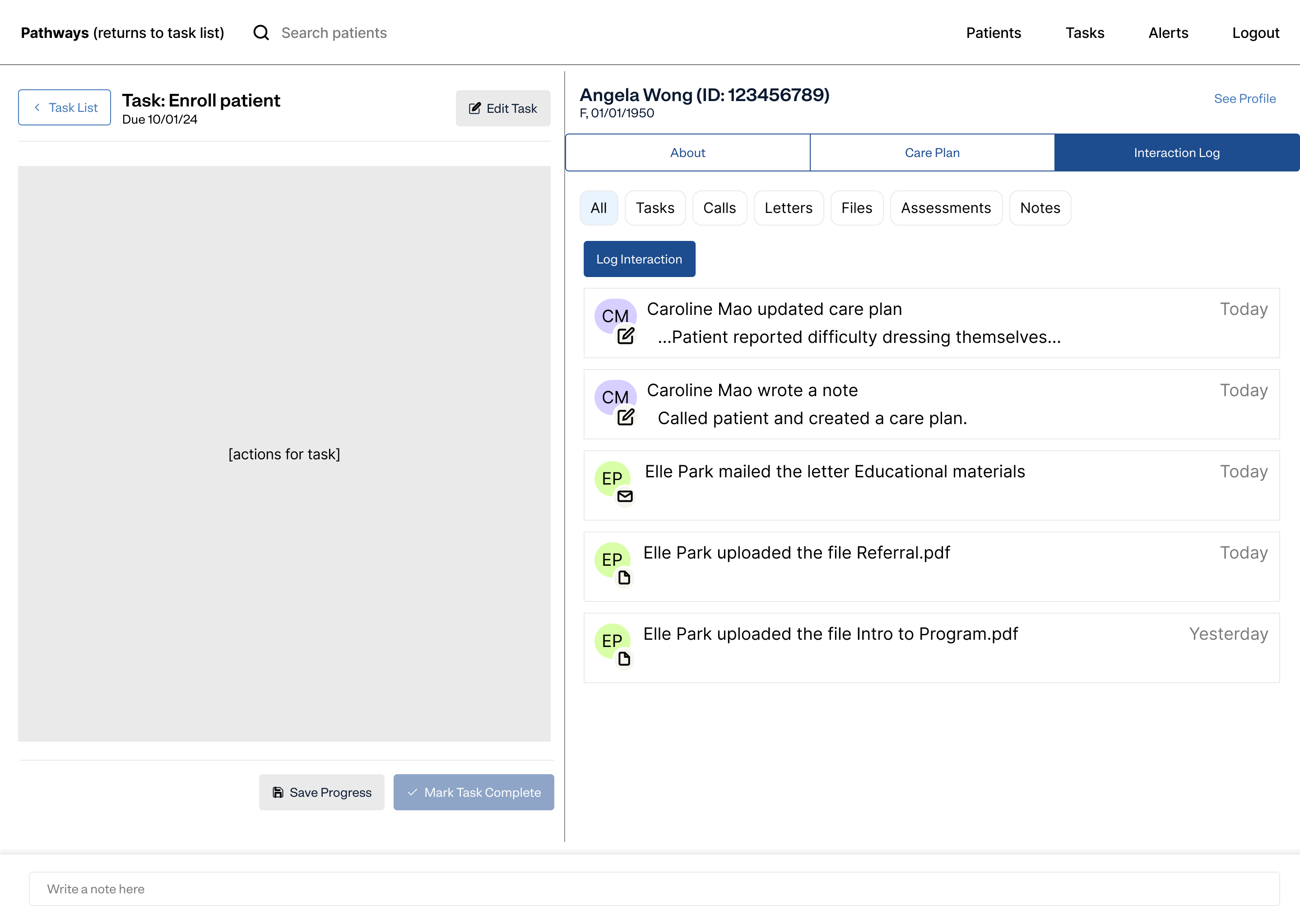
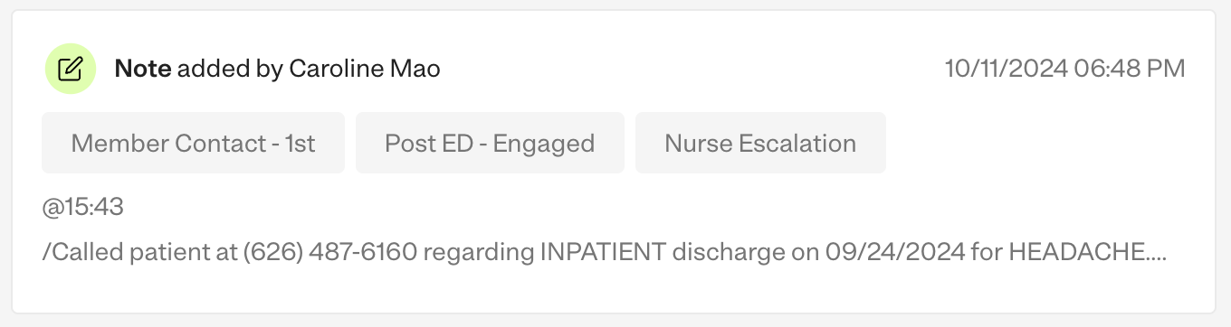
I used accordions for each action type, allowing users to skim quickly and expand sections for more context. Colored icons visually distinguished each action type.
(Not) integrating tasks
A separate project I was working on in parallel was adding task management features. At first, I wanted to include tasks in action history, but this created confusion when considering how tasks would interact with actions. Ultimately, I decided not to include them for simplicity.
Ease of multitasking
I aimed to minimize the need for tab-switching by keeping essential info accessible.
Ease of locating info
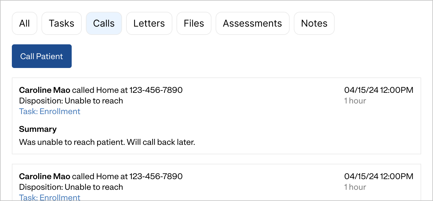
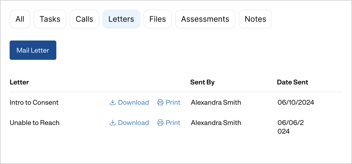
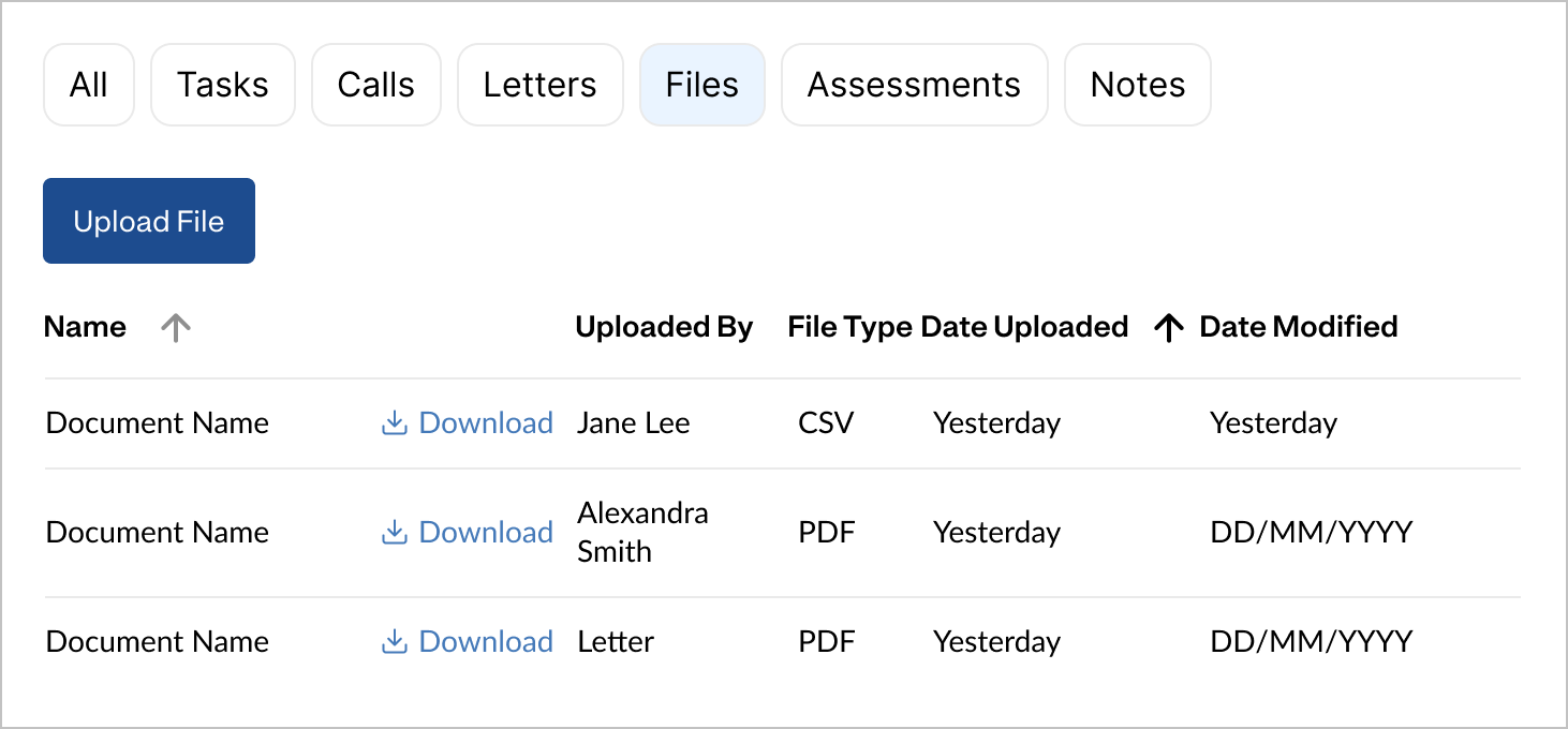
Users need to easily locate the specific action they're looking for. For ease of navigation, I ordered actions chronologically and added filters for each action type.
I ran the designs by a few care management supervisors, who agreed that the action history would make it much easier to understand a patient's history of care.
Version 1.0
Delivering the MVP
Rather delivering a fully optimized and detailed action history, we opted to launch a minimally viable first version so we could get feedback more quickly and iterate faster. For big design projects, I like to use an incremental approach of aligning on the direction for a v0—"this is where we want to get to eventually, but it would take us a long time to get there"—and then designing a smaller, simpler v1 we can ship faster.
(Fortunately around this time, we scaled the Pathways team from 2 engineers to 8, so we were able to build a v1 much faster than I'd anticipated.)
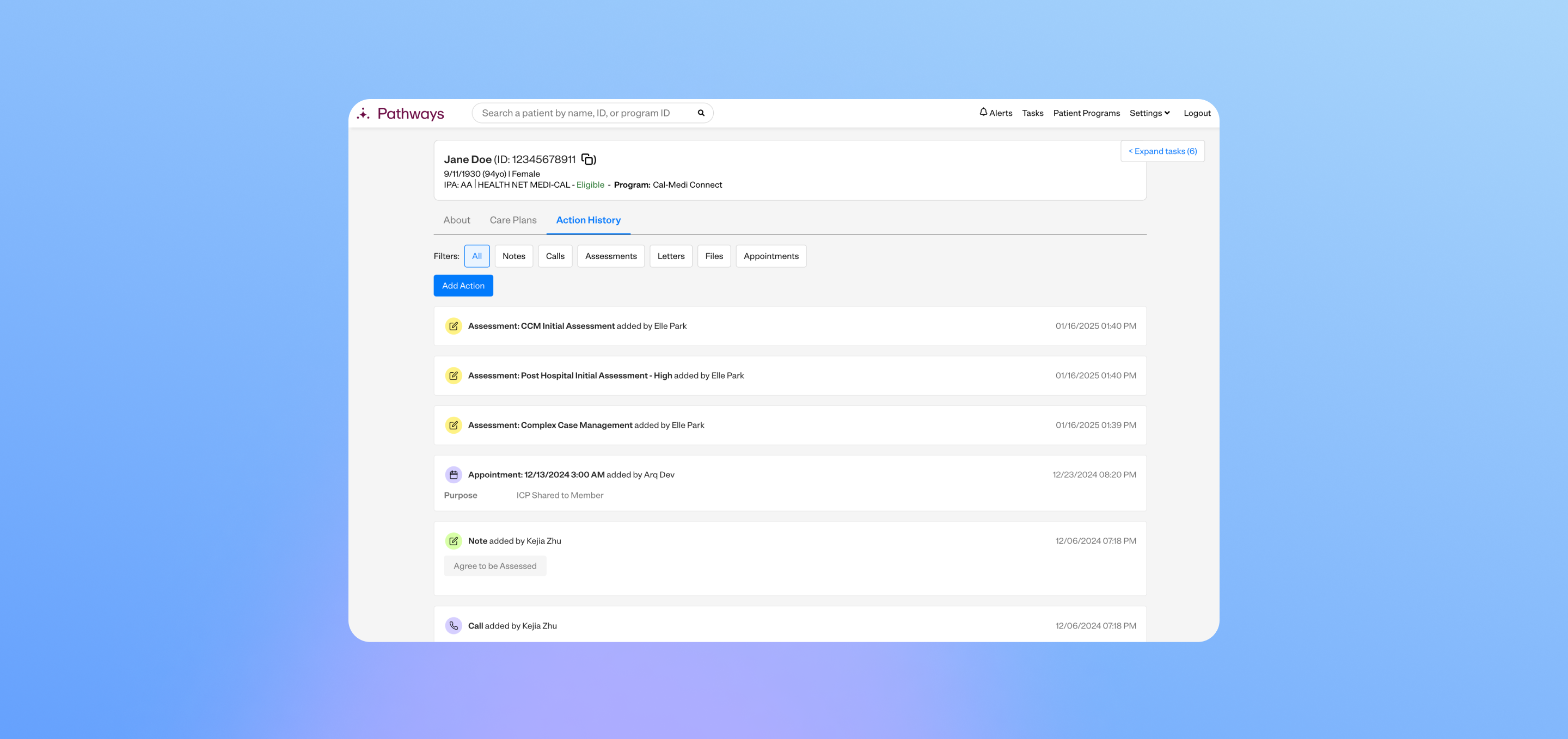
v1 was very, very simple, with a focus on core functionality over optimizing details.
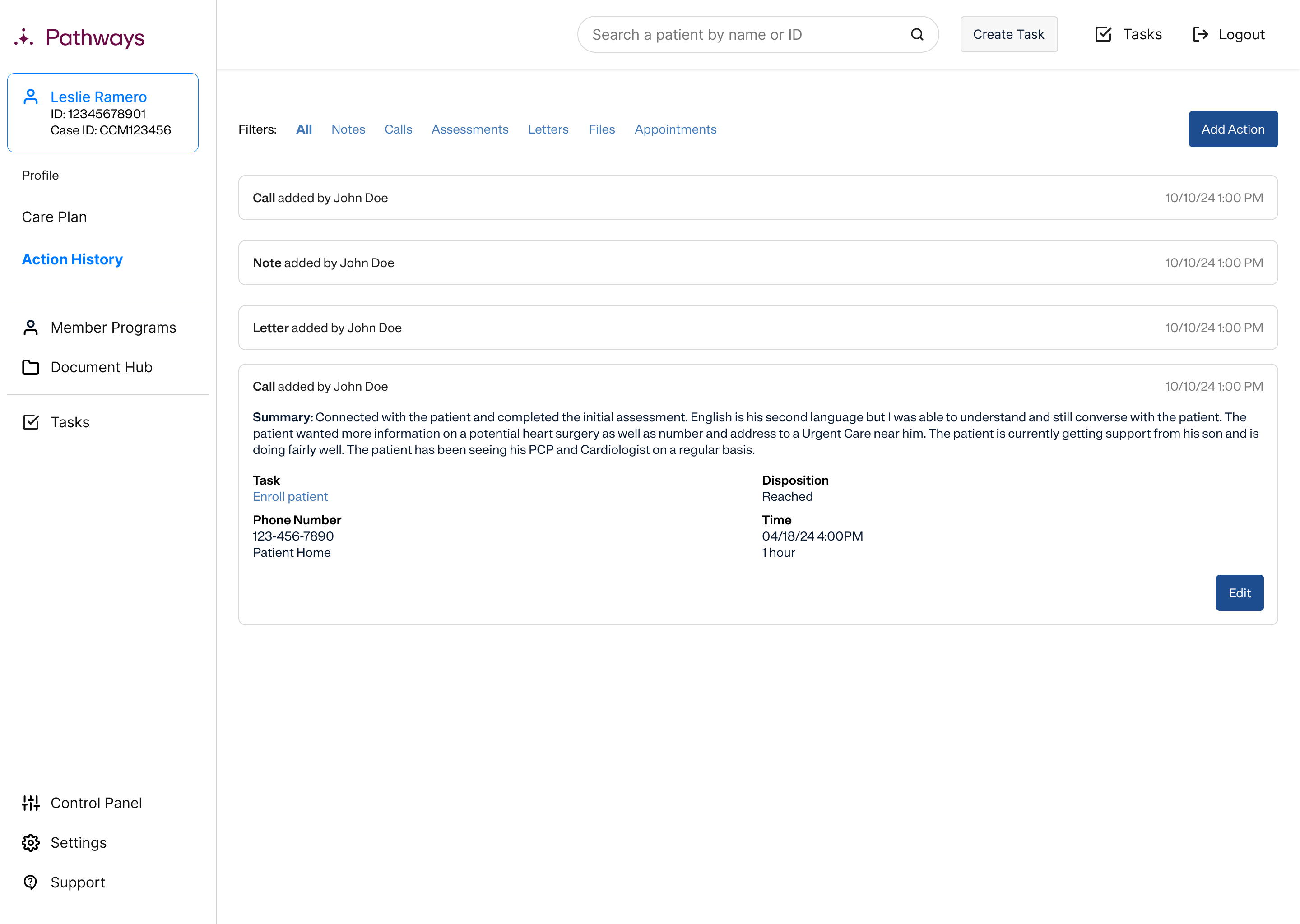
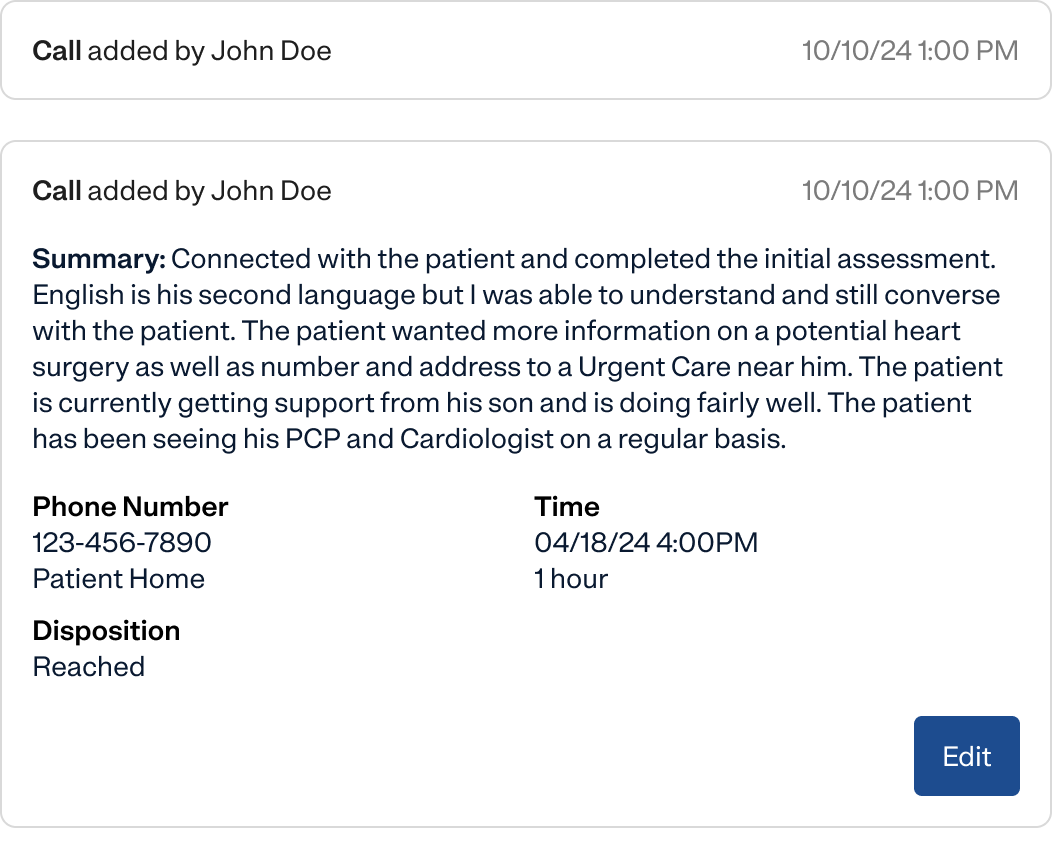
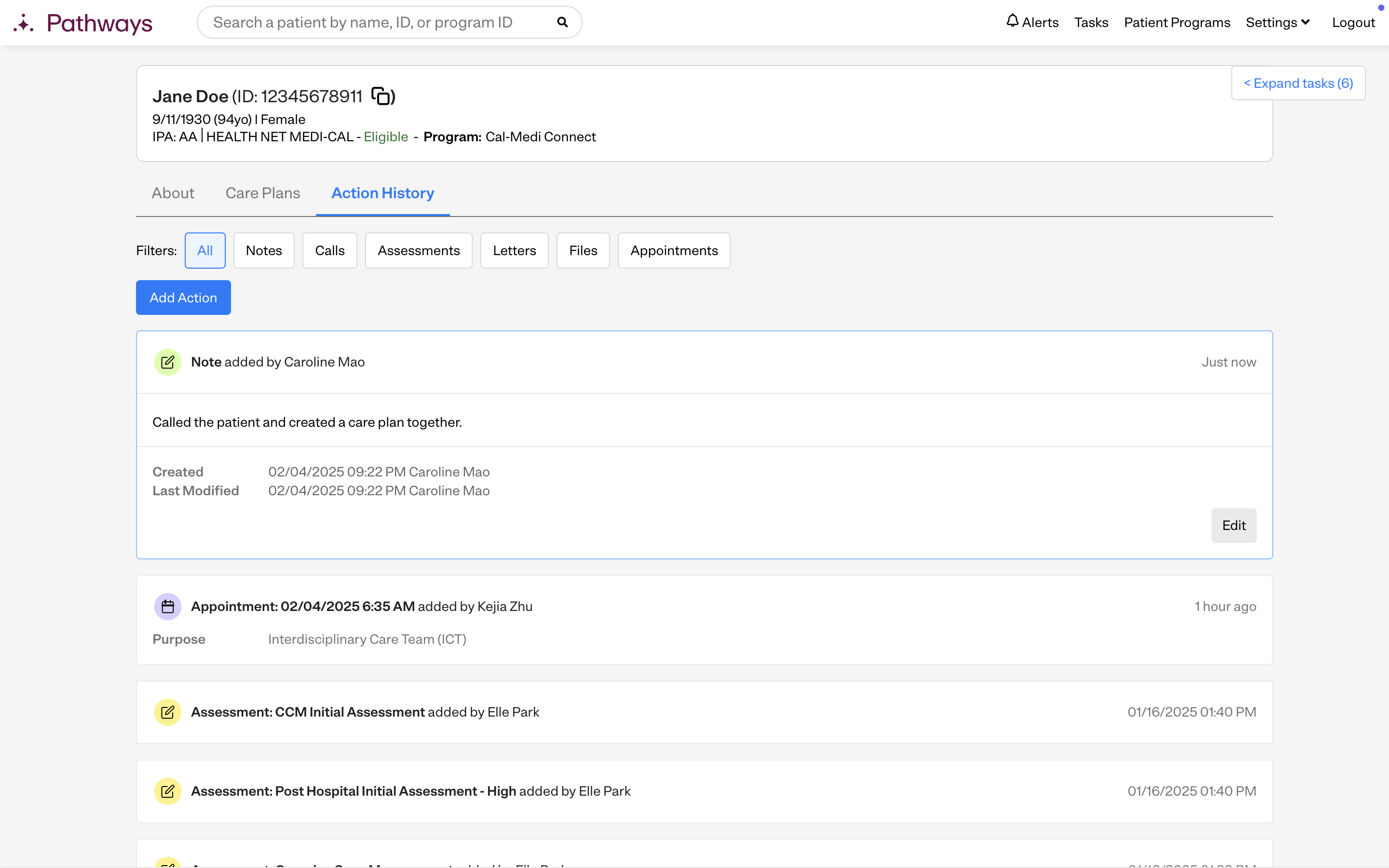
Each action was displayed as a collapsed accordion. This allowed me to fit lots of information into a smaller space, and users could click to expand and see more detailed information.
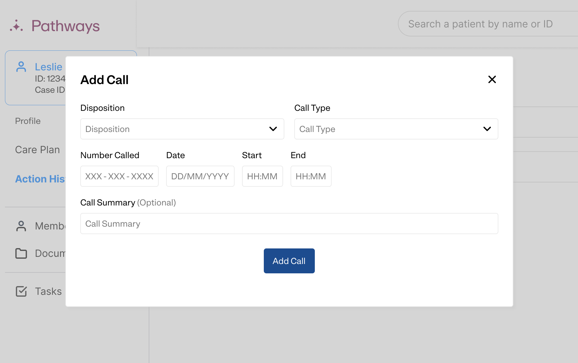
A generic popup-based workflow for adding actions. You chose the type of action you want to add, then a popup shows up to add it. Using the same workflow for each action made it easier for users to pick up quickly.
While I knew the popups weren't ideal UX, they were very quick for developers to implement so we could get feedback faster.
User feedback
Understanding areas of improvement
I consulted a focus group of 4 internal users to ask for their feedback on v1 of the action history. I also gathered feedback asynchronously from a Teams channel of our users. (One of the benefits of working on an internal application is that your users are your coworkers, so they're usually pretty easy to reach.)
- Users didn't like the popups. They blocked out the screen, making it difficult to view other info they needed while doing their work.
- They were confused by the action history overall, since the fundamental navigation of the patient profile had changed. They were used to the separate pages for each action, but now it was all combined into one page.
- It was easy to lose progress on assessments by accidentally clicking outside the popup. This was important because assessments are really long and often have dozens of questions.
- The collapsed states of the accordions didn't show enough information for users to easily locate the actions they were looking for. As a stopgap solution before v2, we shifted to having accordions be expanded by default.
Version 2.0
Improving on the MVP
After synthesizing my user feedback from v1, I created designs for v2 and ran it by some users to validate that it addressed their pain points.
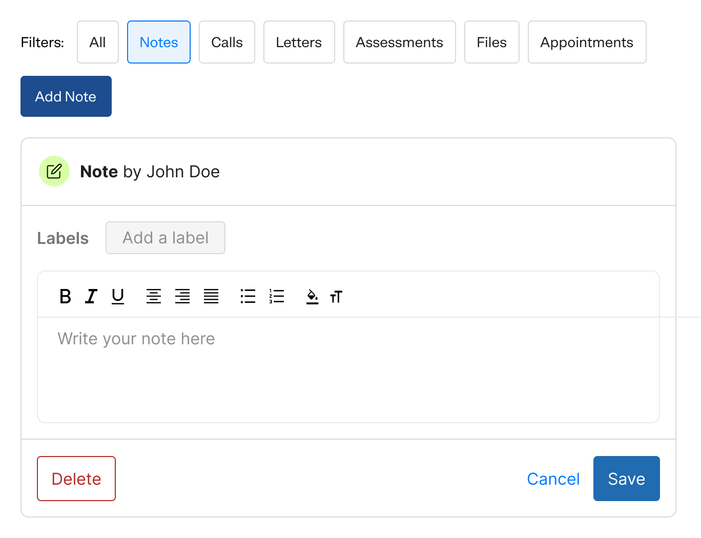
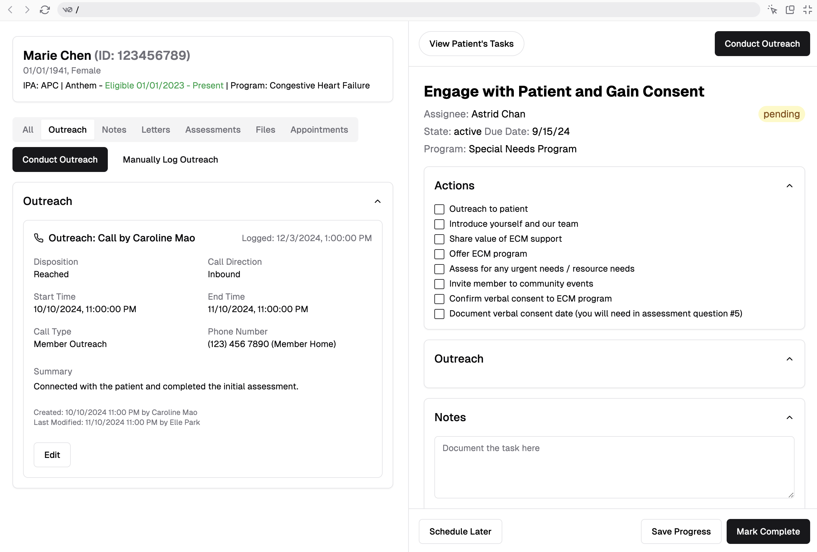
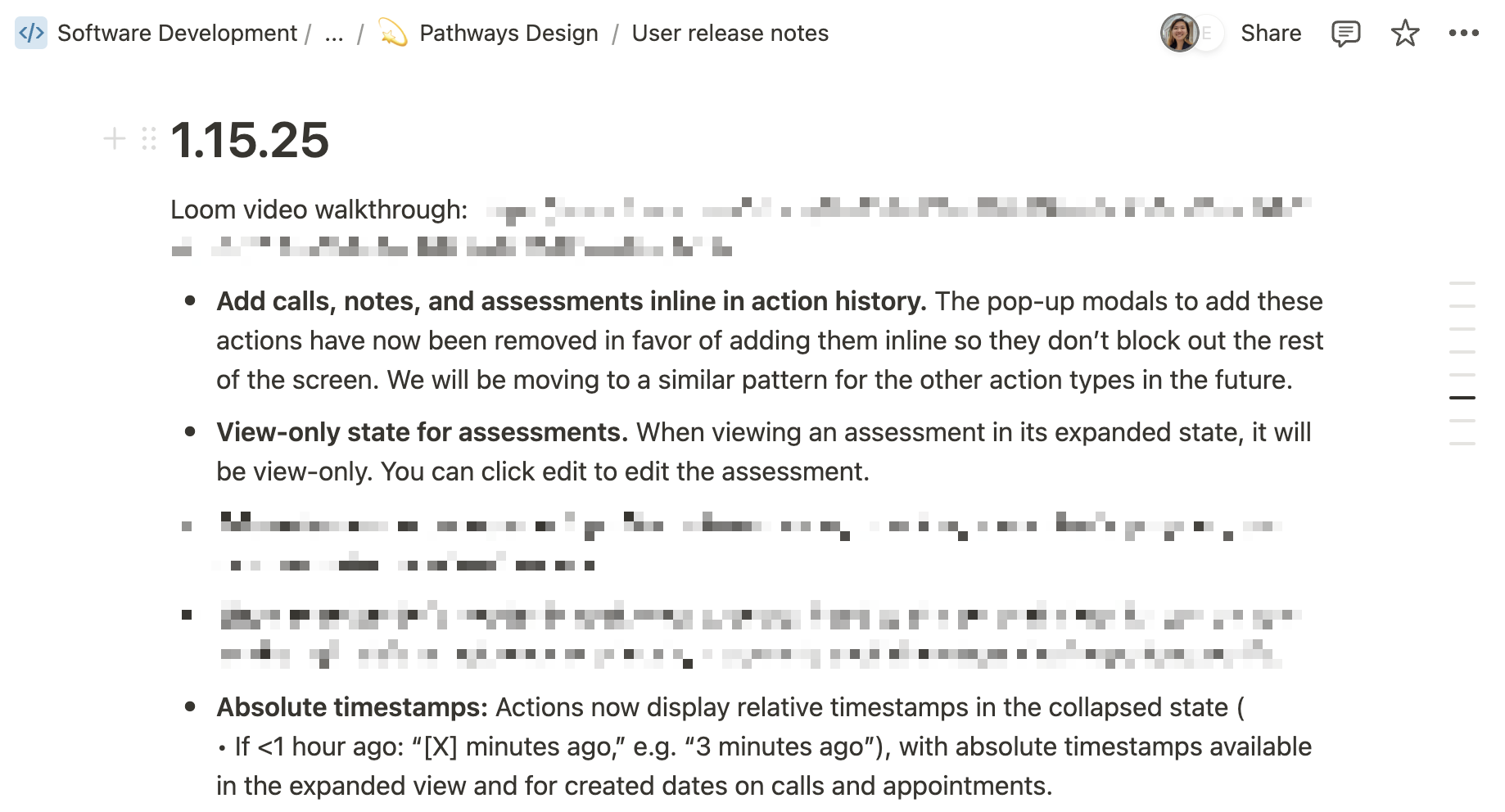
Adding actions as inline instead of in a popup
Users liked that this wouldn't block out the rest of the screen, enabling multitasking and easy information access.
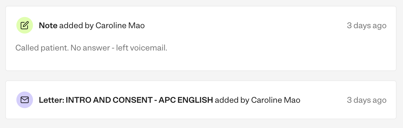
Collapsed states for accordions show essential information
Users mentioned key fields and labels that they needed to see in order to quickly understand the contents of an action.
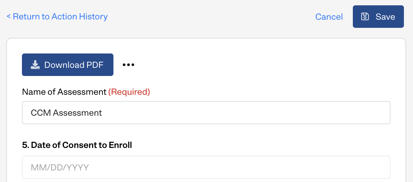
Separate view and edit states for assessments
Assessments were particularly complex due to their length, so clicking the edit button took users to a separate page. I also created a view-only state so users could see assessments without worrying about accidentally editing them.
Relative timestamps and colored icons for better readability
These helped users more quickly identify an action's type and relative age. (The absolute timestamps were still shown in expanded accordions for compliance reasons.) I'd originally designed these ideas for v0, but cut them from v1 in order to decrease initial scope.
Note from Caroline
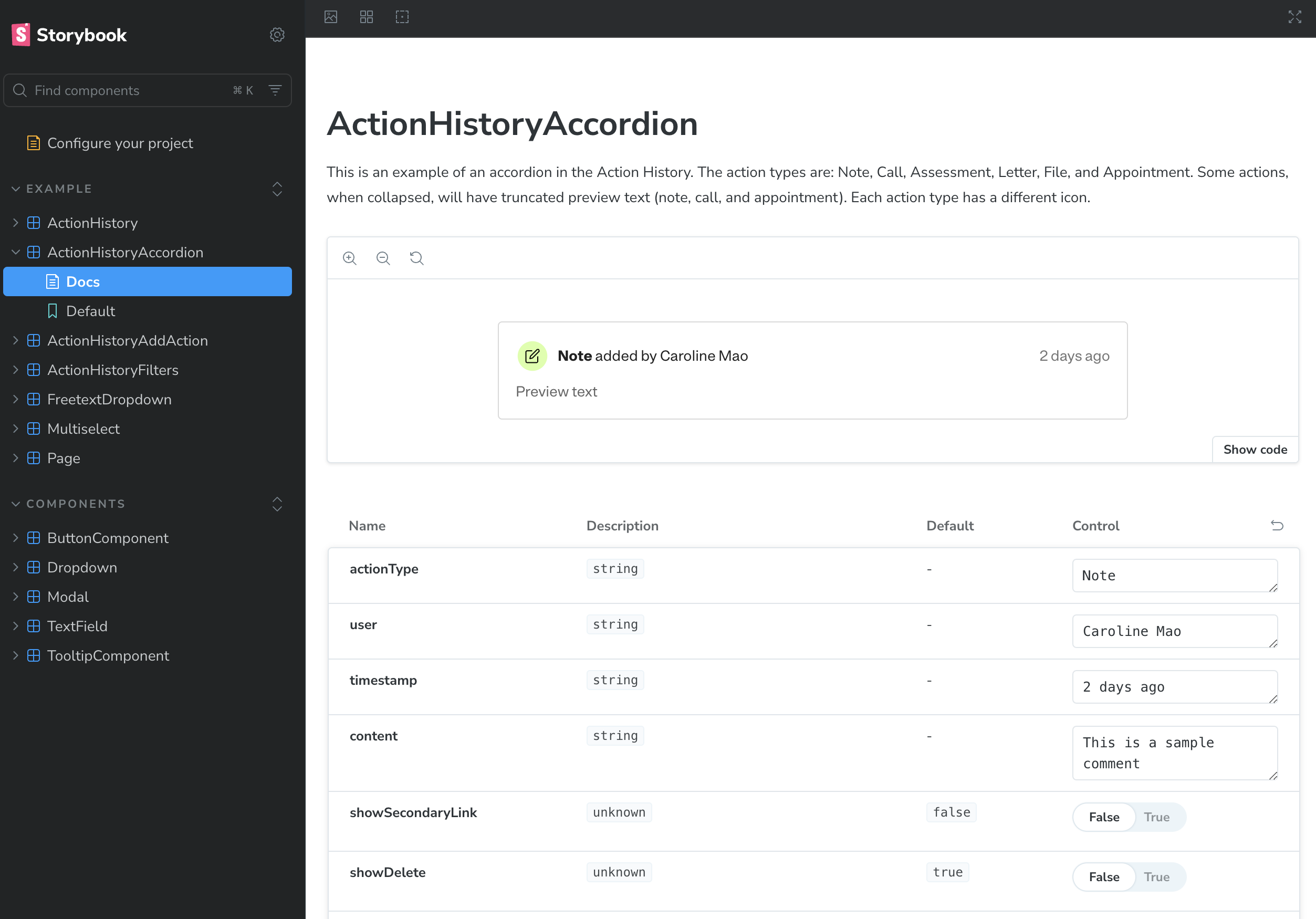
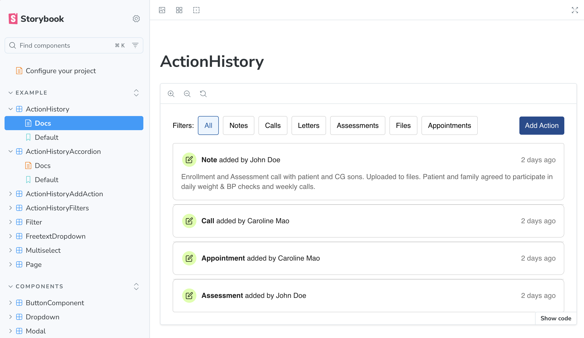
I also began an initiative to use Storybook for our design system. I leveraged Cursor to create action history components like the redesigned accordions in Storybook, which the developer, Farhan, then imported into the Pathways codebase. It's been really cool to work more closely with engineering and hold Pathways to higher standards of design quality.
Final result
Understand care managers' interactions with a patient, all in one place.
 Successes
- A unified timeline of patient interactions helped care managers quickly review a patient's history of care and reduce switching between tabs.
- Care managers could more easily collaborate by seeing other users' engagement with a patient, making patient handoffs smoother and reducing miscommunication.
- Simpler, more intuitive workflows for adding, editing, and reviewing actions made it easier for users to learn to use Pathways.
Learnings
It's important to user test interactive flows, not just static screens.
The more nuanced interactions of the action history, such as the collapsed states for accordions, were easy for users to miss when looking at static designs. If I'd realized this sooner, v1 would likely have been better received.
Starting a Storybook to document key components helped close the gap between design and development.
This sped up design → dev time and resulted in more pixel-perfect components, while lowering the time spent on design QA.
Be mindful when you're having users change their existing workflow.
Healthcare is filled with complex requirements and context, so it's important to strike a balance between forming your own opinion on how workflows should work vs. patronizing your users. Collaborating with stakeholders and getting buy-in early on is essential, rather than dropping huge changes unexpectedly in their lap.
Discuss your rollout strategy and order of implementation.
For example, when shipping v2, it was important to deliver inline adding first to our users—a key piece of functionality that would improve their quality of life—over visual-only changes like the colored icons.
By shipping incrementally and prioritizing the most important functionality, users felt more heard about their concerns and had time to adjust to the changes.
 Password Protected
I've password-protected this case study to maintain confidentiality. If you'd like to continue reading it, please enter the password (which can be found on my resume) or contact me!