Improving the user experience for a data systems startup's website
Redesigning the Voltron Data website
Team
Maura (content director)
Kelly and David (developers)
Luis (graphic designer)
Lucas (motion designer)
+ the Voltron Data go-to-market team
Skills
UX design
Visual design
Stakeholder research
Go-to-market strategy
Problem
Voltron Data, a Series B data systems startup, faced challenges with its website: low user traffic, high bounce rates, and poor quality leads. Originally designed while in stealth mode, the sparse navigation and limited content no longer aligned with their growth and vision.
Goal
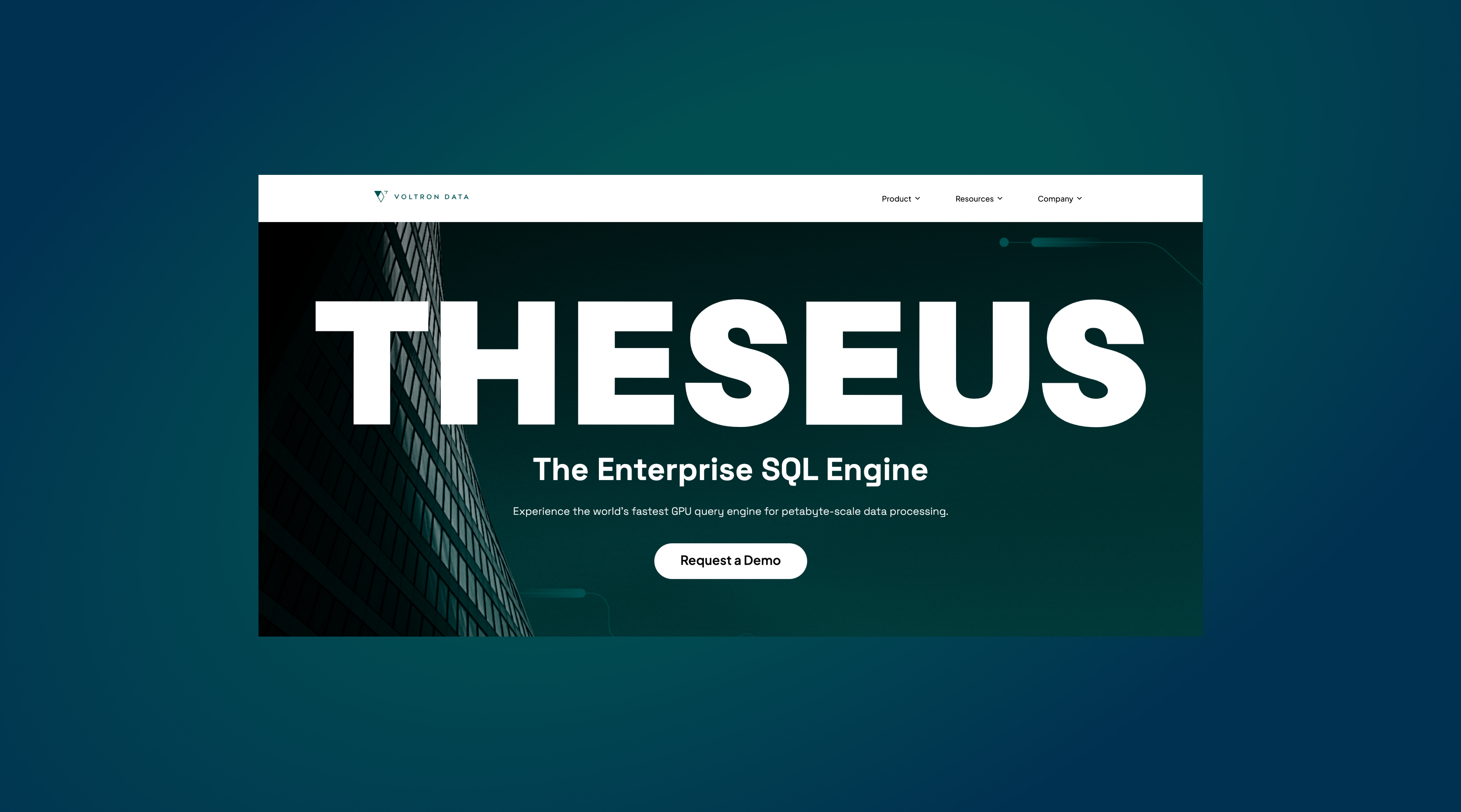
Create a content-rich, user-friendly website that effectively communicates their role as thought leaders in the data systems space and promote their new product, Theseus.
A secondary goal was to generate better quality leads.
We were on a tight deadline because we wanted to be able to show the world the redesigned website at GTC, Nvidia's AI conference, which limited the timeline to 6 weeks.
Research Insights
User Data Analysis
Using Plausible site analytics, I examined user behavior:
- Most Visited Pages: Homepage and resource pages, with the "Codex" and other resources achieving the longest average visit duration (~3 minutes).
- Underperforming Pages: Spotlight Pages received very little traffic.
- Engagement Metrics: A high bounce rate (>60%), low average visit duration (1m32s), and limited page views per visit (1.98) indicated users weren't engaging deeply with the content.
- Traffic Sources: Most visitors arrived via direct access or Google searches. VoDa's ties to the open-source community suggest an opportunity to drive traffic through backlinks from relevant projects and author pages.
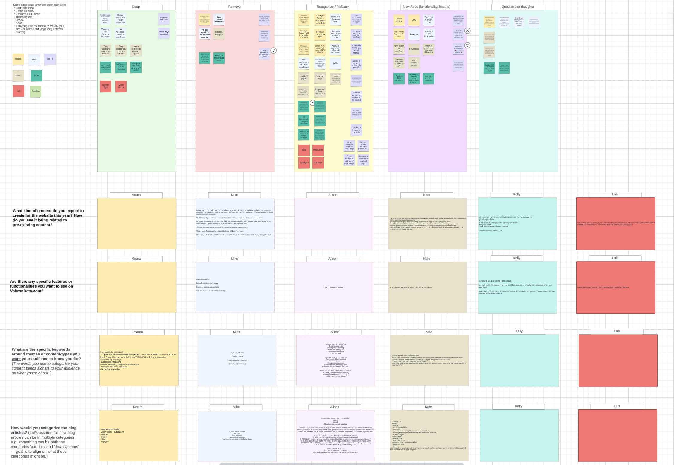
Stakeholder Interviews
I conducted 1:1 interviews and facilitated a group workshop discussion with members of the go-to-market team, which revealed some pain points:
- Perception and Vision: VoDa wants to be seen as a thought leader in data systems but struggles to articulate its vision and demonstrate the relevance of its products.
- Lead Generation: The website wasn't attracting qualified leads for product demos.
- Content and Navigation: Blogs were disorganized, CTAs unclear, and spotlight content difficult to locate.
- Scalability: The lack of a CMS hindered content updates, and there was no standardized approach to content design.
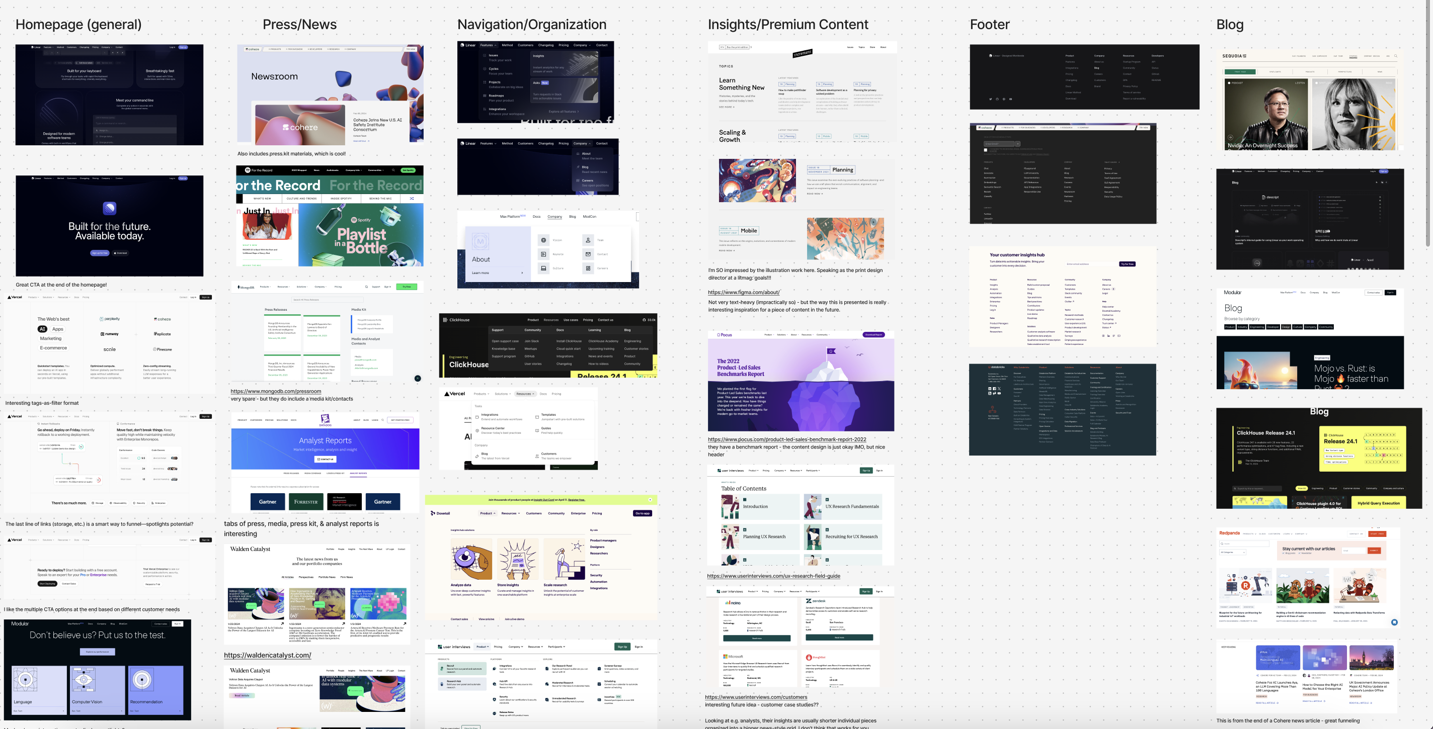
Landscape Research
Analyzing technical websites to identify best practices
Homepage
Clear narrative flow with CTAs tailored to diverse user needs.
Navigation
Comprehensive menus with descriptive links, icons, and "New" tags for recent content.
Resources
Premium content was often split into digestible pieces with landing pages for easy navigation.
Blog and Footer
Blogs featured categories, big visuals, and email signup forms, while footers provided categorized links for SEO optimization.
Design Solutions
Website Structure
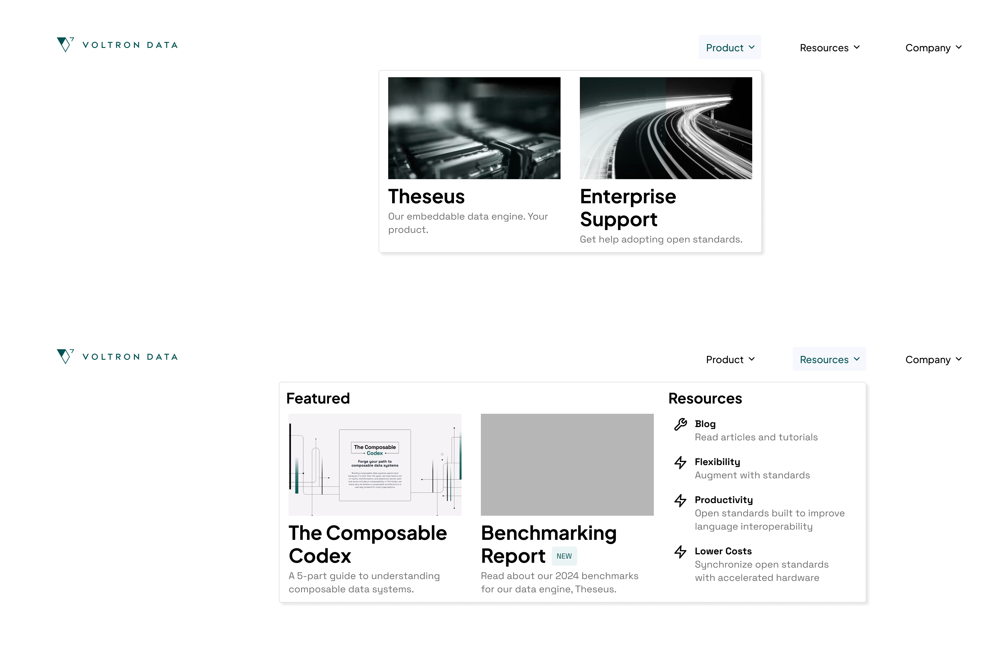
- Information Architecture: Redesigned navigation to include descriptive categories like "Product," "Resources," and "About." Dropdown menus divide links into logical subcategories.
- Removed extraneous, infrequently-visited pages.
Homepage
- Clear Narrative: Structured to lead users through VoDa's vision, product offerings, and resources, ending with tailored CTAs.
- Visual Emphasis: Large headlines and images highlight key content and recent updates.
Resource and Blog Pages
- Premium Content Hub: Created landing pages with tables of contents for long-form resources like the Codex and the Benchmark Report.
- Blog Organization: Introduced categories to improve ease of navigation and a clear email signup form to enable engagement.
Final Results
 Password Protected
I've password-protected this case study to maintain confidentiality. If you'd like to continue reading it, please enter the password (which can be found on my resume) or contact me!